Data Exploration in Python: Height and Weight of NHL Players Using 3 Methods
Data exploration in python can be as complex, or as painless as we want it to. It is possible to load a data set and calculate every statistics, metrics, and graphs from scratch. It is also possible to use functions to simplify the coding of the most common exploratory statistics. Complete libraries now also exist to (almost) automate the whole data exploration process for us. Sometimes, the most automated way will be useful, but at other times more customisation is required. Therefore, it is important not only to understand when to use each tool, but how to use each tool.
For this project, I decided to briefly showcase three ways to explore data in python:
- By manually computing different summary statistics and visualisations
- By using the .describe() method with pandas to greatly simplify the computation of summary statistics
- By using the Pandas Profiling library that automates much of the data exploration process
The data set that I am using is this nhl_bio_2020.csv file that I generated using the NHL data api. It contains the bio information (age, height, weight, nationality, etc.) of every NHL player that played in the 2020–2021 shortened season. With the emphasis on big bodies in the league, specifically at the defenseman and goalie positions, I was curious to see how heights and weights were distributed across players (and at the same time, I was able to try Pandas Profiling that everyone is talking about!).
Data Exploration Method 1: Manually
Zero of all, we need to make sure that all dependencies are installed for the project. From the terminal, it is possible to use pip or pip3 to install each package manually, but a neat trick is to use the requirements.txt file by storing it in the same folder as your python script, and using:
pip3 install -r requirements.txt
Now that our libraries are installed and out of the way.
First of all, we will want to import the relevant libraries and load the data set.
import pandas as pd
import numpy as np
import matplotlib.pyplot as plt
import seaborn as sns

data = pd.read_csv("nhl_bio_2020.csv")
data = data[['first_name', 'last_name', 'height','weight', 'position_name']]
print(data.head())
## Results of data.head():
first_name  last_name height  weight position_name
0       Josh     Jacobs  6' 2"     200    Defenseman
1       A.J.      Greer  6' 3"     210     Left Wing
2       P.K.     Subban  6' 0"     210    Defenseman
3      Scott  Wedgewood  6' 2"     207        Goalie
4       Matt   Tennyson  6' 2"     205    Defenseman
There is a lot of information in the data set, so I limited it to the names of the players, their height, weight and position name as I am interested in the differences amongst positions.
The first thing that jumps when looking at the head of the data, is that the height is not formatted in a way that we can work with it nicely. The weight also could be changed to kg instead of lbs. Let’s store each of the height and weight data as separate numpy arrays for now, and convert them into numbers we can comprehend better:
height = np.array(data["height"])
weight = np.array(data["weight"])
## Conversion of weights from lbs to kg
x = 0
for item in weight:
weight[x] = round(item * 0.453592, 1)
x+= 1
## Conversion of heights from feet and inches to cm
x = 0
for item in height:
height[x] = int(item[0:1])*30.48 + int(item[2:item.find('"')])*2.54
x += 1
So what is happening in the above? I looped through each item in the array to convert its weight. Converting weights is easy enough, we just have to multiply by a factor of 0.453592 to convert lbs to kg.
For heights, the same looping idea, but I also had to extract the feet and inches as separate numbers out of the string. Then, convert each of those two numbers to cm. Once the numbers are extracted, it is important to remember to convert them to integers using the int() function. The .find() string attribute is a blessing! It returns the position of a certain substring inside a string. So, I could find the position where inches stopped.
Our next step is to decide which summary statistics to calculate, and then calculate them. Fortunately, most of these are basic functions in numpy anyway. I decided to go simple, looking at the:
- mean,
- standard deviation,
- minimum,
- maximum,
- 25th percentile,
- median and
- 75th percentile
of heights and weights.
print("Mean of heights = ", height.mean())
print("Standard Deviation of height = ", height.std())
print("Minimum height = ", height.min())
print("Maximum height = ", height.max())
print("25th percentile =", np.percentile(height, 25))
print("Median = ", np.median(height))
print("75th percentile = ", np.percentile(height, 75))
## Output of prints:
Mean of heights =  185.95473684210555
Standard Deviation of height =  5.488611988684077
Minimum height =  162.56
Maximum height =  205.74
25th percentile = 182.88
Median =  185.42
75th percentile =  190.5
print("Mean of weights = ", weight.mean())
print("Standard Deviation of weight = ", weight.std())
print("Minimum weight = ", weight.min())
print("Maximum weight = ", weight.max())
print("25th percentile =", np.percentile(weight, 25))
print("Median = ", np.median(weight))
print("75th percentile = ", np.percentile(weight, 75))
## Output of prints:
Mean of weights =  89.38631578947368
Standard Deviation of weight =  7.02560895321074
Minimum weight =  63
Maximum weight =  115
25th percentile = 84.0
Median =  89.0
75th percentile =  94.0`
As we can see, the median height of NHL players is quite high, at just over 185 cm. I am using the median as it is more robust to outliers, but it seems like the average is not far from it. At the extremes we see that the highest player was a towering 205 cm (hello Zdeno Chara!) and the smallest player is 162 cm (Nathan Gerbe), quite a difference between both.
Similarly, the median and average weights are similar, at 89 kg. Here, the difference between the lightest and heaviest players is just ridiculous, with 63 kg for the lightest vs 115 kg for the heaviest — almost double the weight!
I also printed the 25th and 75th percentiles, but it can be easier to visualise the boxplot and a histogram of the distribution to get an idea of the shape of our data.
plt.boxplot(height)
plt.title("Heights of NHL players")
plt.xlabel("height(cm)")
plt.show()
It is much easier to see the quantiles than to read them as numbers! We can also see that the minimum and maximums are indeed outliers. From this boxplot, it looks like there is a lot of players with height falling between the 25th and 50th percentiles (the median), so between 182 and 185 cm. There is more dispersion with taller players, but players over 190 cm still account for a huge 25% of the league!
plt.boxplot(height)
plt.title("Weights of NHL Players")
plt.xlabel("weight(kg)")
plt.show()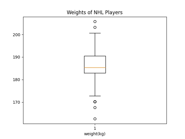 This looks very similar to the boxplot about heights. This makes sense, as taller players tend to be heavier and smaller players lighter.
Now, let’s see how the distributions look like:
sns.set()
plt.hist(height)
plt.title("Height Distribution of NHL players")
plt.xlabel("height(cm)")
plt.ylabel("Number")
plt.show()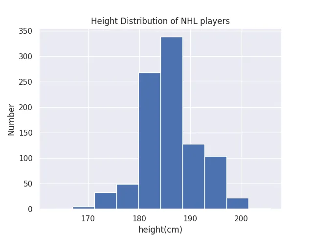 It looks like the height of NHL players approximately follow a normal distribution, and we better visualise how small our standard deviation is.
Also, it is pretty clear that there is a cutoff for players under 180 cm, agreeing with the notion that smaller players have a much harder time to find a job in the NHL. This is something that was not as clear when looking at the numbers and boxplot.
Now, let’s look at the distribution of weights:
sns.set()
plt.hist(height)
plt.title("Weight Distribution of NHL Players")
plt.xlabel("weight(cm)")
plt.ylabel("Number")
plt.show()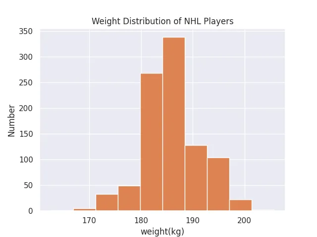 This distribution is almost an exact copy of the distribution of heights. These are probably heavily correlated, but we will see it with a future tool of data exploration.
This is all for the manual method of data exploration! Calculating each metric manually, and plotting each figure manually required a lot of repetitive task. It was also prone to human error, as each label needed to be set and formatted nicely. What is good though is that we had full control of the output. The next two methods will be much quicker and less error-prone, although less customizable.
Data Exploration Method 2: Using Pandas describe()
An alternative to doing all the work above manually, we can use the describe() method, which calculates the standard deviation, mean, max, min, 25th, 50th, 75th percentiles automatically.
We do have to perform the conversions on the pandas dataframe, as we only converted the numpy arrays earlier:
data = pd.read_csv("nhl_bio_2020.csv")
data.head()
data = data[['first_name', 'last_name', 'height','weight', 'position_name', 'team_name']]


data['weight'] = round(data['weight'] * 0.453592,1)
data['height'] = data['height'].str[0:1].astype(int)*30.48 + data['height'].str[2:5].replace('"','', regex=True).astype(int)*2.54`
And describe():
data["height"].describe()
## I will skip weights as it is the same metrics as earlier
# data["weight"].describe()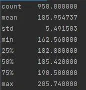
This is great! One line of code instead of… eight! Moving on to Pandas Profiling.
Data Exploration Method 3: Using Pandas Profiling
describe() is great as it is only one line of code. But, it only output the metrics and did not output any visualisations for us. Pandas Profiling does this, and more! It creates a full on data exploration report on your dataframe.
One simply needs to import ProfileReport from the pandas_profiling package into the python script, and call the appropriate function, and tadam! A really nice report is generated.
from pandas_profiling import ProfileReport


prof = ProfileReport(data)
prof.to_file(output_file='../pandas_profiling.html')`
The generated report is output to the name you want, in this case “pandas_profiling.html”. It is a html file that can be opened in a browser and offers some neat visualisations for distribution, missing values, interactions and even correlation matrices. And it is interactive. The report that was generated by the NHL player’s height and weight data set can be found here.
Let’s go over the big items, starting by the Overview tab:
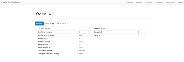 The Overview tab provides very basic information about the data set: number of variables, size, memory, missing values, duplicates, etc.
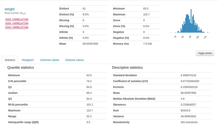
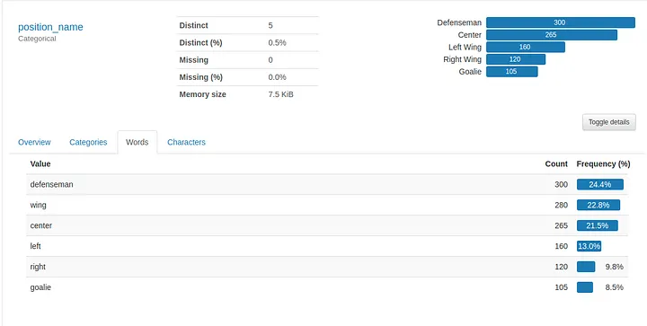
Next is the “Variables” tab, which provides summary statistics and visualisations of every variable in the data set. The summaries are even different whether the variable is numerical or categorical.

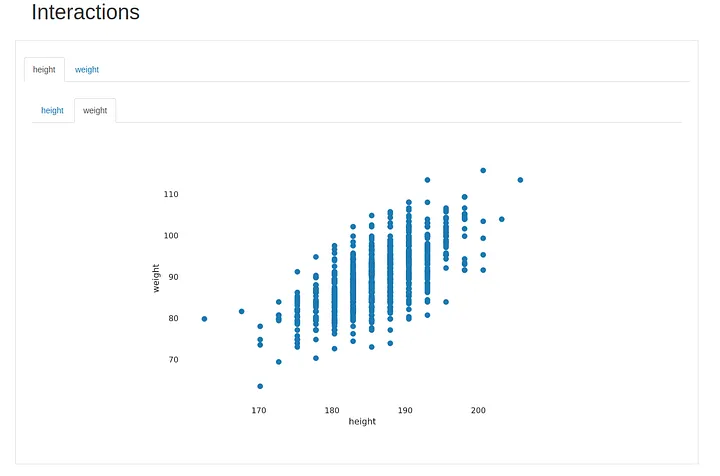
Next tab is the “Interactions” one, where we can explore different combinations of variables to visualise how they interact with each other. In this case we can only check height and weight, but if we had salary information, number of points, or any other numerical variables, we would be able to explore the different combinations and, at a glance, have an intuition of the interaction between each pair of variables.
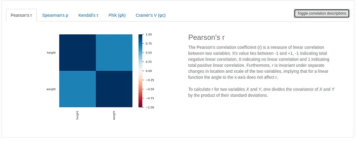
Next up is the correlation matrix. Pandas Profiling gives us the option of exploring the correlation matrix with 5 different scores, and we can even toggle a description of the score, which is great when dealing with a new score.
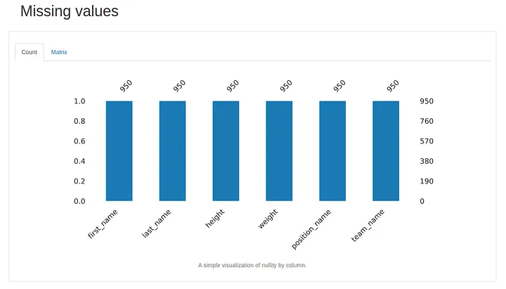
And the second to last tab is the missing value tab. In this case, we have no missing values for any variable. But, if we had some, it would show here.
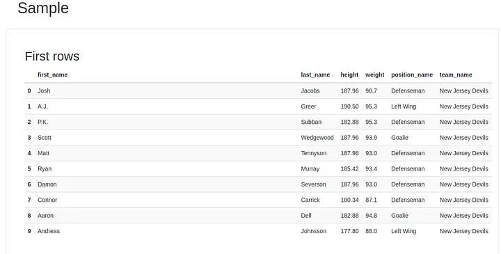
And last but not least, a sample of the rows, which reminds us the .head() method. There is also a “Last Rows” table just down below in the report, so we can have an idea of the first 10 and last 10 rows of our data set.
Pandas Profiling is a nifty tool that can simplify the life of anyone who needs to explore a data set.